Oversized images break layouts, slow down pages, and make uploads harder than they should be. Here is how to resize an image properly without stretching it, cropping the wrong area, or exporting a blurry result.
I built image tools like this because too many online resizers make a simple job feel risky. Some force uploads to a server, others hide the sizing logic, and many ruin the image by default. This tool runs locally in the browser, so your data never leaves your device and no server-side uploads are required for standard resizing.
Why Resizing Matters
A lot of images are much larger than the space where they will actually appear. A blog content area might display an image at 1200 pixels wide, but the uploaded file could still be 4000 pixels wide.
That mismatch creates unnecessary weight. The file takes longer to load, uses more bandwidth, and can make a perfectly fast page feel slow.
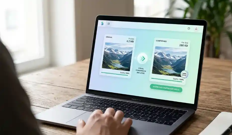
Resizing fixes that by changing the actual dimensions of the image. If compression reduces file size through encoding, resizing reduces file size by reducing the number of pixels.
Resizing vs Compression
These two terms get mixed up constantly, but they solve different problems.
Resizing changes image dimensions such as width and height. Compression changes how efficiently the same image data is stored.
If an image is physically too large for the layout, use an Image Resizer to reduce the dimensions. If the dimensions are already correct but the file is still too heavy, use an Image Compressor to shrink the file size.
In many real cases, the best result comes from doing both. Resize the image first, then compress it before publishing so the page loads faster without sacrificing visual quality.
How to Resize an Image Online
The cleanest workflow is simple:
Go to SolutionBazz Image Resizer tool and follow below steps.
- Upload your image
- Enter the target width and height
- Keep Maintain Aspect Ratio enabled unless you have a reason not to
- Choose a resize mode like Exact, Contain, or Cover
- Pick the output format
- Resize and download the result
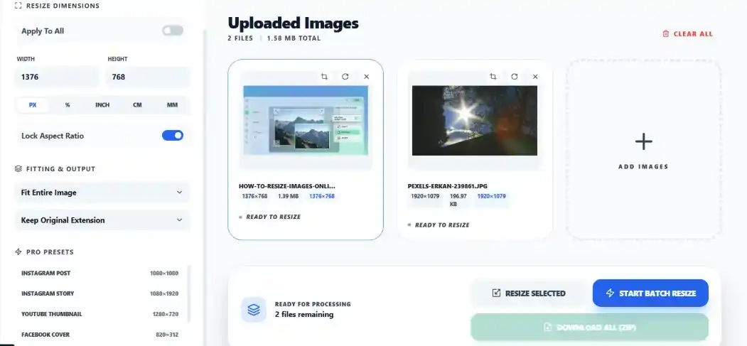
If you are working with several files, upload them together and apply the same settings in one pass. That is useful for blog images, product photos, and social assets.
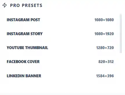
Start With the Right Dimensions
The biggest mistake in image resizing is guessing dimensions. You usually want to resize based on the actual use case, not on what “looks about right.”
A few practical examples:
- Blog images: around 1200px wide
- YouTube thumbnails: 1280 x 720
- Instagram posts: 1080 x 1080
- Facebook cover images: 820 x 312
- LinkedIn banners: 1584 x 396
This tool includes ready-made presets for common formats like Instagram Post, Instagram Story, YouTube Thumbnail, Facebook Cover, and more. That saves time and cuts down on sizing mistakes.
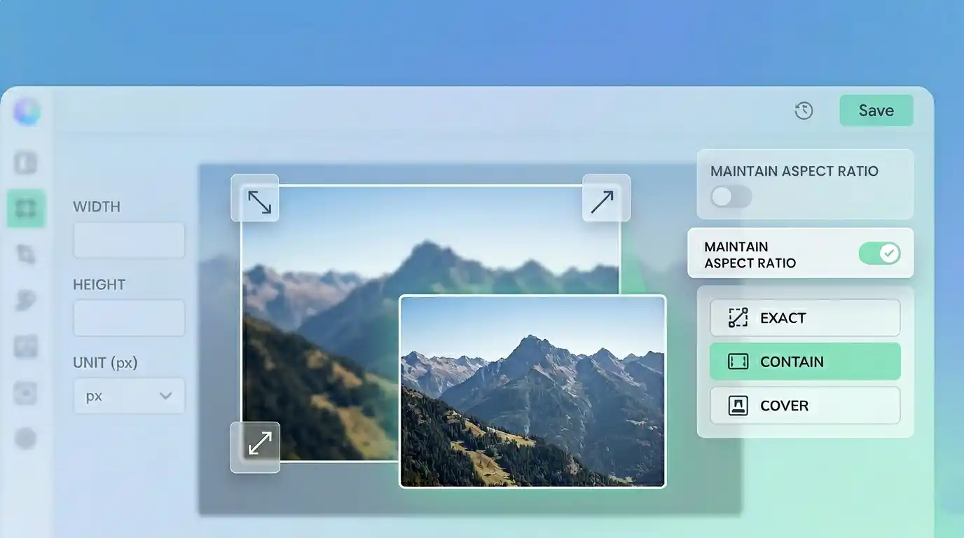
Keep the Aspect Ratio Intact
Most of the time, you should leave Maintain Aspect Ratio turned on. That keeps the image proportional so it does not look stretched or squashed.
If you change width without preserving the original ratio, faces get wider, logos look distorted, and product photos lose trust immediately. The only time to disable it is when you intentionally need an exact canvas size for a specific layout.
Exact, Contain, and Cover
These three modes matter more than most users expect.
Exact forces the image into the dimensions you specify. This is useful when you truly need a fixed size, but it can distort the image if the ratio does not match.
Contain resizes the image to fit within the target box without cropping. This is the safest option when you want the entire image visible.
Cover fills the full target area, even if that means some parts of the image may be cropped. This is useful for banners, thumbnails, and card images where consistent framing matters more than showing every edge.
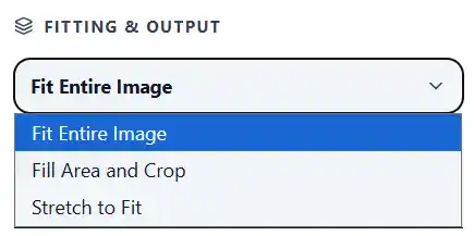
If you are unsure where to start, use Contain. It is usually the least destructive option.
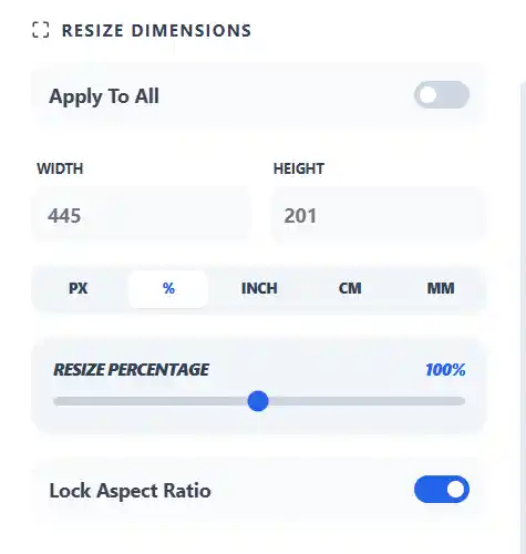
Choose the Right Unit
Pixels are the right choice for most web work. If you are preparing images for a website, app, blog, or social platform, use px and think in screen dimensions.
This resizer also supports percentage, inch, cm, and mm. Those are useful when you are preparing print-ready images or resizing relative to the original file.
For example:
- Pixels for websites and social media
- Percentage for simple scaled-down copies
- Inch/cm/mm when physical print size matters
- DPI when you care about print output quality
What DPI Actually Means
DPI stands for dots per inch. It matters mostly for print, not for standard on-screen web display.
That is where users often get confused. A high DPI value does not magically fix a low-resolution image. If the image does not have enough pixel data to begin with, changing DPI alone will not make it sharper.
For web use, focus on dimensions in pixels first. For print use, dimensions and DPI both matter.
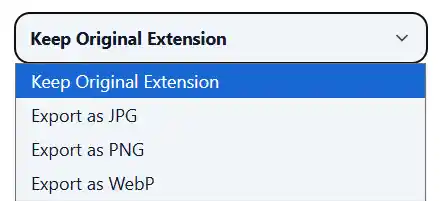
Best Output Format After Resizing
After resizing, choose the format based on the image type.
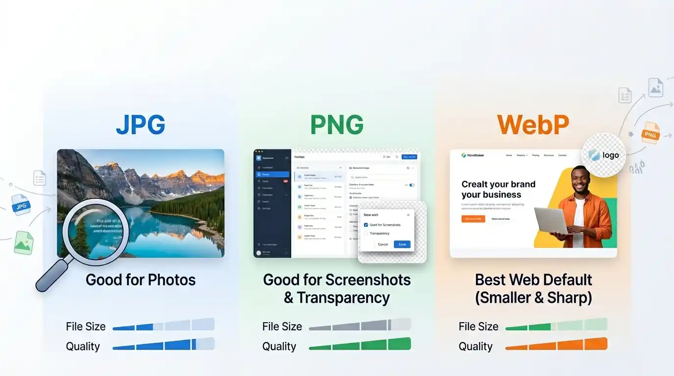
JPEG works well for photos and keeps files relatively small.
PNG is better when you need transparency or crisp graphic edges.
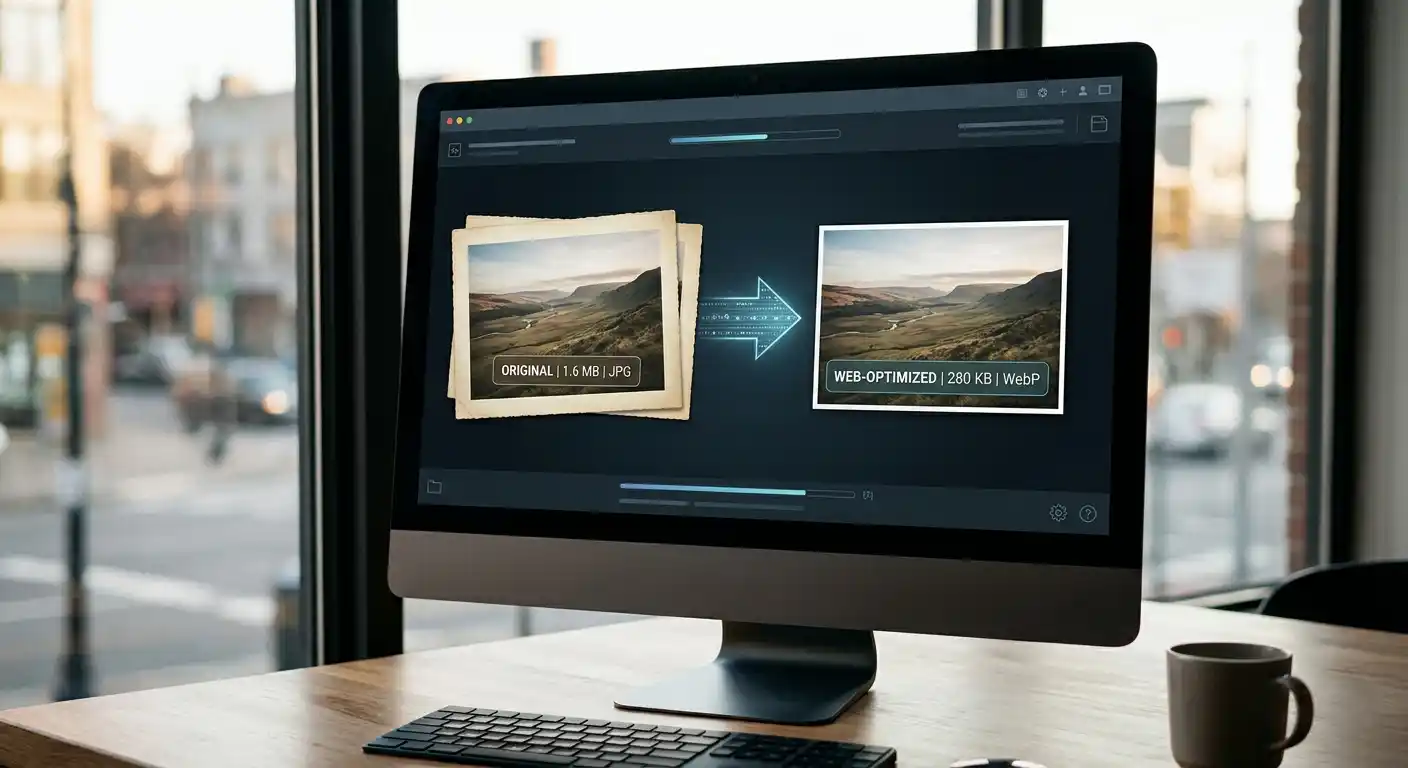
WebP is often the best option for websites because it usually gives smaller files at similar visual quality.
Original is fine when you only want to change dimensions without switching formats.
If your goal is faster page speed, WebP is usually worth testing first. If you need to change the file type directly, use the Image Converter or go straight to the JPG to WebP Converter for a faster workflow.
Resize for Real Use Cases
The best resizing settings depend on where the image will end up.
For blog content, resize to the maximum display width of the article area. There is no benefit in serving a 3000-pixel image into a 1200-pixel container.
For ecommerce, keep product photos large enough to look trustworthy when zoomed, but not so large that category pages get heavy.
For social media, use the preset that matches the platform instead of improvising. That prevents awkward crops and blurry previews.
For email attachments, resize aggressively before sending. A smaller image is easier to upload, faster to download, and less likely to hit attachment limits.
When Cropping Is Better Than Resizing
Sometimes resizing alone is not enough. If the composition is wrong for the target format, the right move is to crop first and resize second.
That is especially true for social banners, thumbnails, and profile-friendly layouts. If the subject is too far from the center or the frame is too wide, forcing the whole image into a new ratio usually weakens the result.
This tool also gives you ways to adjust the image before export, which makes it easier to prepare a cleaner final version without leaving the browser.
Common Resizing Mistakes
The first mistake is choosing dimensions that are much larger than the actual display area. That keeps the file heavier than necessary.
The second mistake is disabling Maintain Aspect Ratio without a reason. Most distorted images come from that one setting.
The third mistake is focusing on DPI for web images instead of actual pixel dimensions. Browsers care about rendered size far more than print metadata.
The fourth mistake is exporting everything as PNG. Photos often come out smaller and just as usable in JPEG or WebP.
Why Browser-Based Resizing Is Better for Privacy
A lot of image tools send uploads to a remote server for processing. That may not sound like a big deal until you are handling client files, internal screenshots, drafts, or personal images.
This resizer works in the browser, so your data never leaves your device during normal use. That keeps the workflow simpler and removes a whole layer of trust you should not have to think about for a basic resize job.
Who This Tool Is Best For
This tool is useful if you need to:
- resize blog images before publishing
- prepare product photos for ecommerce
- create social media assets with exact dimensions
- shrink email attachments
- export smaller website images in WebP
- batch-process multiple images quickly
It is also useful if you care about privacy and do not want to upload files to third-party servers just to change width and height.
FAQ
Will resizing reduce image quality?
It can if you shrink too aggressively or export in a poor format. Done properly, resizing keeps the image clean while removing unnecessary pixels.
What is the best resize mode for most users?
Contain is usually the safest starting point because it preserves the full image without distortion.
Should I resize or compress first?
If the image dimensions are much larger than needed, resize first. Then compress if you still want a smaller file.
Is WebP better after resizing?
For many website images, yes. WebP often gives a smaller file than JPEG or PNG at similar visual quality.
Pro Tip
If you are preparing images for the web, do not resize based on the original file. Resize based on the actual display width of your layout, then export to WebP for the best balance of clarity and file size.
Try the tool
Need the right dimensions fast?
Use the Image Resizer to resize images locally in your browser. No server-side uploads required.
Try the Image Resizer