A slow page does not always come from complicated code. Half the time it is three oversized images doing quiet damage in the background.
I keep seeing the same pattern: someone uploads a 4032 x 3024 phone photo, drops it into a layout where it only displays at 1200 px, exports it as PNG because it “looks sharper,” and then wonders why the page feels sluggish. At that point the site is carrying far more bytes than it needs. The good news is that image size is usually one of the easiest performance problems to fix.
Most Website Images Are Bigger Than They Need to Be
Not slightly bigger. Usually way bigger.
If an image is displayed at 1200 px wide, shipping a 4000 px file is just waste. The browser still has to download it, decode it, and render it. Visitors do not get a better experience because the source file is huge. They just wait longer.
This is usually the first thing I check now. Before compression. Before fancy format discussions. Just basic dimensions.
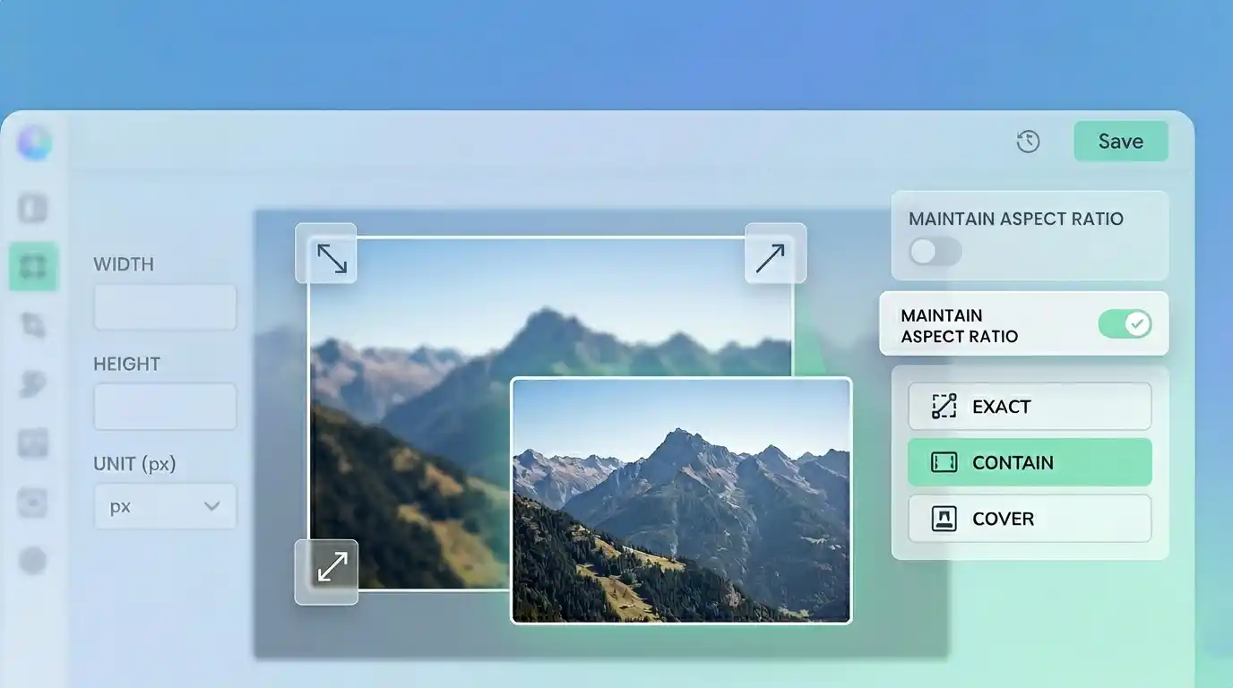
Start With Dimensions, Not Compression
People jump to compression because it sounds like the obvious “make it smaller” tool. Sometimes that works. Often it is fixing the wrong problem.
If your content image only needs to render at 1200 px, resize it to something close to that. A 4200 px image that gets resized properly can lose far more weight than one that stays huge and just gets compressed harder.
That is why I usually start with an Image Resizer. If the layout does not need the extra pixels, get rid of them first.
Compression Helps, but It Is Not Magic
Once the dimensions make sense, compression starts doing useful work.
Compression is what trims file weight without changing the visible width and height. For photos, that usually means reducing quality just enough that normal users will not notice. For graphics and screenshots, it gets trickier because sharp edges fall apart faster.
This is where people overdo it. They drag the quality setting down until the file looks impressively small, then realize the image now has muddy textures and weird artifacts around text. Smaller is not automatically better.
A good compression pass should make the file lighter without making the image look cheap. That is where the Image Compressor earns its place.
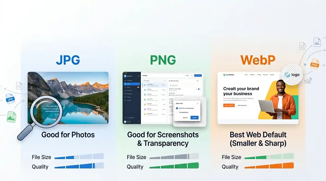
The Wrong Format Causes a Lot of Damage
Format choice still gets underestimated.
A regular photo saved as PNG is one of the easiest ways to bloat a page. I have seen simple article cover images land at 1.5 MB to 2 MB as PNG when the same visual could have been something like 250–400 KB as WebP and still looked perfectly fine at normal display size.
The usual practical rule is still solid:
- use WebP for most web delivery
- use JPG when compatibility matters
- use PNG when you need transparency or very crisp text and edges
If you need to switch formats quickly, use the Image Converter. If the file started as JPG and the goal is better website performance, the JPG to WebP Converter is usually the fastest route.
WebP Usually Gives the Best Return
I am biased toward WebP for websites because it keeps proving itself in real use.
A resized hero image that sits around 520 KB as JPG often drops to something closer to 300 KB as WebP. Not every file gets that kind of win, but enough do that WebP is usually my first test. It is one of the few optimizations that can be both practical and noticeable without requiring a big workflow change.
That said, I would not convert blindly. Screenshots with fine text, charts, or UI details can still look better as PNG. If the image has sharp interface edges, test the result instead of assuming the smaller file is the better one.
A Simple Workflow That Usually Works
This is the workflow I trust most now:
- resize the image to realistic display dimensions
- choose the right format
- compress only as much as needed
- compare the result at actual display size
That order prevents a lot of bad decisions.
If you do it backwards, you end up compressing a giant file that should have been resized first, or squeezing a PNG that should have been converted to WebP in the first place.
Some Useful Size Targets
These are not hard rules, but they are decent sanity checks.
For a lot of normal websites:
- article images often work well around 1200 px wide
- large hero images often work around 1600 px
- many blog visuals should land somewhere under 300 KB
- large polished hero images can still be fine under 500 KB
- if a normal content image is still 1 MB+, something probably went wrong
I would rather use numbers like these as a checkpoint than obsess over tiny percentage gains. If you get a banner from 1.8 MB down to 280 KB and it still looks clean, you are done. No need to spend another fifteen minutes chasing 20 KB.
The Mistake I See Most Often
People use original uploads straight from phones or cameras.
Those files are almost never ready for the web. They are too large in dimensions, often heavier than necessary in metadata and encoding, and usually meant to preserve flexibility, not delivery efficiency.
Another common mistake is keeping every image as PNG because it feels “safe.” Safe for what? If the image is a regular photo with no transparency, PNG is often just expensive indecision.
Screenshots Are a Different Case
Screenshots do not behave like photos.
If the image contains code, tables, settings panels, or tiny labels, aggressive compression gets ugly fast. This is one place where I am happy to keep a slightly heavier PNG if it preserves legibility. A fuzzy settings screenshot on a tutorial page is worse than a somewhat larger file.
So the goal is not “make every image as small as possible.” The goal is “make every image as small as it can be without breaking what matters.”
Where People Waste Time
Over-optimizing images that are already good enough.
If a content image is resized properly, exported to WebP, and ends up around 220 KB, I am not going to keep tweaking it unless it is a mission-critical landing page asset. There is a point where the human time costs more than the saved bytes.
Image optimization should be practical. Fix the obvious waste first. That gets most of the result.
A Better Rule Than “Compress Everything”
If I had to reduce this whole topic to one rule, it would be this:
Match the image to the layout, then match the format to the image type.
That one habit prevents most bloated website images before compression even enters the conversation.
What I’d Actually Do on a Normal Page
If I were preparing images for a standard website today, I would usually do this:
- resize article and blog images to fit the real content width
- export photos as WebP first
- keep screenshots as PNG unless testing proves otherwise
- use compression after the above, not before
- check the final image at normal viewing size, not zoomed in like I am auditing pixels for court evidence
That last part matters. A lot of people panic over imperfections nobody will ever see in actual use.
Pro Tip
If a website image feels too heavy, do not ask “How much more can I compress this?” first. Ask “Does this image even need to be this big?” That question usually leads to the real fix faster.